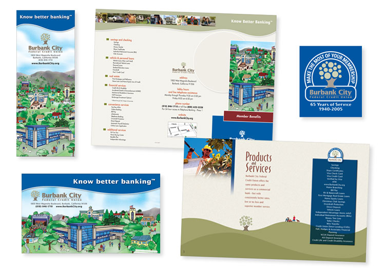
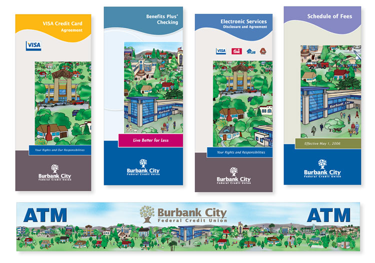
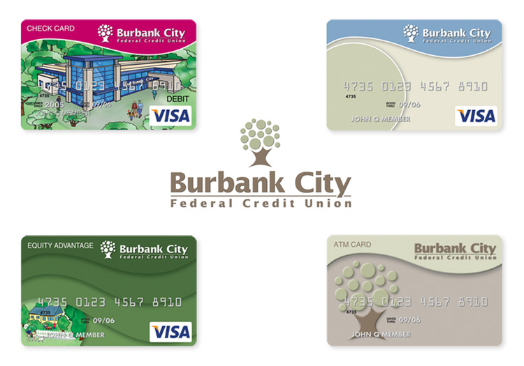
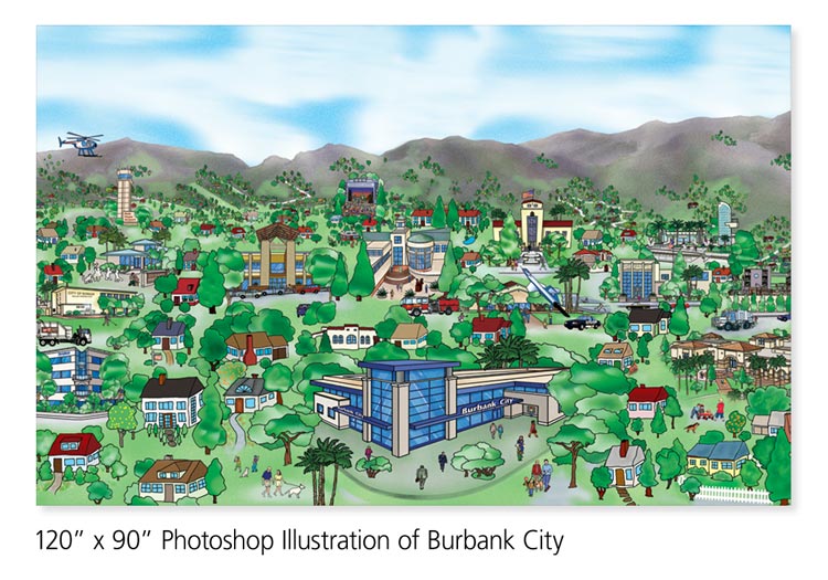
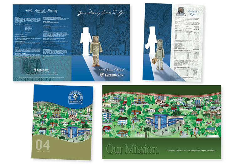
Burbank City Federal Credit Union
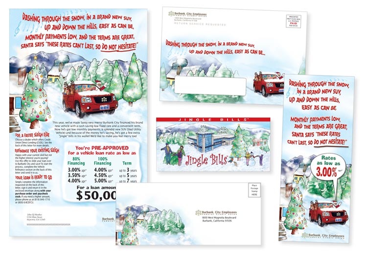
Commissioned to illustrate a lobby display, the 10 foot by 7.5-foot cityscape encapsulated the flavor of the Burbank community and BCFCU's integral part. The cityscape in whole or in part, played a major role in the Credit Union's brand. Also a name change brought the opportunity to reinvent a fresh brand carried throughout all product lines. The round and curved graphic design elements relate to the architectural redesign and expansion of the credit union building. Although they are now Gain FCU, this work will always be one of our favorites to show off: from wall murals and ATM displays to credit/debit card design, and so much more.
We've successfully worked with 21st Century Design Group on dozens of projects. When we needed to revise our fifty-plus-year-old corporate logo, we awarded the job to 21Cs. The result was a refreshingly confident and optimistic re-working of our classic design. Most importantly, it was instantly recognizable to our members and easily reproducible with all media – print, web, embroidery, backlit signage, and high definition video.